Post by ronwarren on Nov 4, 2012 9:12:56 GMT -5
Split toning and "reducing the color palette"
( see www.ronwarrenphotography.blogspot.com/2012/09/split-toning-and-reducing-color-palette.html ).

After every photoshoot, the same thing happens for me. Someone (usually my terrific spousal unit) will ask, "So, how'd it go?" And I always answer, "Don't know, yet." And I mean it. Oh, I have a reasonably good idea if I got any keepers or if it was a total wash, but between the screen-size and resolution of the camera's display and what I know might be done with careful editing, I truly don't know whether or not to be happy about a shoot until I've run a few pix through Lightroom.
A standard "keeper" will get the full batch of edits (exposure, color correcting, probably a bit of skin softening, selective sharpening, cropping, etc. etc.). Lately, however, I've managed to save a few shots I wasn't previously thrill with, by taking advantage of the split toning tool and indulging in an editing philosophy I will call "reducing the color palette".
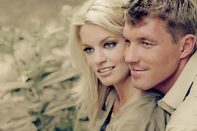
The photo above is one example. I know the die-hards will scoff at the dramatic difference between the post and the SOOC. My opinion about editing pictures is that there is a time and a place for every sort of editing. For example, I generally don't like those HDR images that are WAY too crisp, too saturated, and generally more like a illustration than a photo. That being said, there are some masters of the process and some individual images that really work with that level of post. And I am forced to say, "WOW!".
And isn't it funny how sometimes the level of post doesn't really trouble the eye until you see the SOOC? I am VERY happy with this image and I don't even think about the post on it until I toggle back and forth between the before and after. (scroll to the bottom of this post for the SOOC shot).
But I digress. Split toning and reducing the color palette.
SPLIT TONING
You probably already know about split toning. You add a color tone to the highlights and/or the shadows, control the saturation and balance of each and affect a subtle or strong color transformation to the image. It is often done to monochrome images to simulate antique looks or the colors of particular films. I apply it to color images as well, usually to enhance the mood of an image. Here, the split toning setting were:
Highlights
Hue 55
Saturation 43
Balance 72
Shadows
Hue 233
Saturation 63
These settings had the effect on this image of warming, homogenizing, and generally giving a feel of an editorial safari shoot. Dr. Livingston, I presume?
How do I decide how to split tone? I usually grab the highlight saturation slider and take it all the way to 100. Then I run the gamut of hues until I find something promising. Then I starting pulling saturation back down until I think it works. Then I do the same thing with the shadows. Then I yank the ol' balance slider back and forth until something makes me smile. Then there might be a final adjustment to any of those sliders (or a fresh look at contrast or exposures) and then I'm done with the split toning.
REDUCING THE COLOR PALETTE
Now what is this "reducing the color palette" business you were talking about? Simply put, I find that too many colors in an image can, on occasion, detract from the overall effect. For instance, if your primary subject and surroundings are of warm colors and there is a splash of something blue off to the side or in an article of clothing, it can have the effect of looking too busy or simply distracting. I will often dull those extraneous colors or pull them into the correct portion of the spectrum (if it's close, I can manage it in Lightroom -- if dramatically wrong, Photoshop). In this image there was no completely wrong color, but I felt that the green of the foliage to the left was distracting, I largely desaturated it, but it retains some color from the split toning. Also, I reduced clarity and sharpness on those plants.
The issue for me usually comes with mixed warm and cool tones in an image. For people I prefer mostly warm colors. Other types of images may have and emphasize their cool colors. And art shots, especially images such as night cityscapes might just knock your socks off with a wildly mixed palette.
But sometimes, just sometimes, you might find that this technique can help to save an image you just weren't that thrilled with at the capture. And with that, here is the above image as it came out of the ol' Canon 40D, as promised.

( see www.ronwarrenphotography.blogspot.com/2012/09/split-toning-and-reducing-color-palette.html ).

After every photoshoot, the same thing happens for me. Someone (usually my terrific spousal unit) will ask, "So, how'd it go?" And I always answer, "Don't know, yet." And I mean it. Oh, I have a reasonably good idea if I got any keepers or if it was a total wash, but between the screen-size and resolution of the camera's display and what I know might be done with careful editing, I truly don't know whether or not to be happy about a shoot until I've run a few pix through Lightroom.
A standard "keeper" will get the full batch of edits (exposure, color correcting, probably a bit of skin softening, selective sharpening, cropping, etc. etc.). Lately, however, I've managed to save a few shots I wasn't previously thrill with, by taking advantage of the split toning tool and indulging in an editing philosophy I will call "reducing the color palette".
The photo above is one example. I know the die-hards will scoff at the dramatic difference between the post and the SOOC. My opinion about editing pictures is that there is a time and a place for every sort of editing. For example, I generally don't like those HDR images that are WAY too crisp, too saturated, and generally more like a illustration than a photo. That being said, there are some masters of the process and some individual images that really work with that level of post. And I am forced to say, "WOW!".
And isn't it funny how sometimes the level of post doesn't really trouble the eye until you see the SOOC? I am VERY happy with this image and I don't even think about the post on it until I toggle back and forth between the before and after. (scroll to the bottom of this post for the SOOC shot).
But I digress. Split toning and reducing the color palette.
SPLIT TONING
You probably already know about split toning. You add a color tone to the highlights and/or the shadows, control the saturation and balance of each and affect a subtle or strong color transformation to the image. It is often done to monochrome images to simulate antique looks or the colors of particular films. I apply it to color images as well, usually to enhance the mood of an image. Here, the split toning setting were:
Highlights
Hue 55
Saturation 43
Balance 72
Shadows
Hue 233
Saturation 63
These settings had the effect on this image of warming, homogenizing, and generally giving a feel of an editorial safari shoot. Dr. Livingston, I presume?
How do I decide how to split tone? I usually grab the highlight saturation slider and take it all the way to 100. Then I run the gamut of hues until I find something promising. Then I starting pulling saturation back down until I think it works. Then I do the same thing with the shadows. Then I yank the ol' balance slider back and forth until something makes me smile. Then there might be a final adjustment to any of those sliders (or a fresh look at contrast or exposures) and then I'm done with the split toning.
REDUCING THE COLOR PALETTE
Now what is this "reducing the color palette" business you were talking about? Simply put, I find that too many colors in an image can, on occasion, detract from the overall effect. For instance, if your primary subject and surroundings are of warm colors and there is a splash of something blue off to the side or in an article of clothing, it can have the effect of looking too busy or simply distracting. I will often dull those extraneous colors or pull them into the correct portion of the spectrum (if it's close, I can manage it in Lightroom -- if dramatically wrong, Photoshop). In this image there was no completely wrong color, but I felt that the green of the foliage to the left was distracting, I largely desaturated it, but it retains some color from the split toning. Also, I reduced clarity and sharpness on those plants.
The issue for me usually comes with mixed warm and cool tones in an image. For people I prefer mostly warm colors. Other types of images may have and emphasize their cool colors. And art shots, especially images such as night cityscapes might just knock your socks off with a wildly mixed palette.
But sometimes, just sometimes, you might find that this technique can help to save an image you just weren't that thrilled with at the capture. And with that, here is the above image as it came out of the ol' Canon 40D, as promised.


